📄 Typography & Text
Full control over fonts, alignment, spacing and text decoration, including drop shadows and justified text.
colorfont-familyfont-sizefont-weightfont-stylefont-stretchfont-variantline-heightletter-spacingword-spacingtext-aligntext-transformtext-decorationtext-shadowvertical-alignwhite-spaceword-break
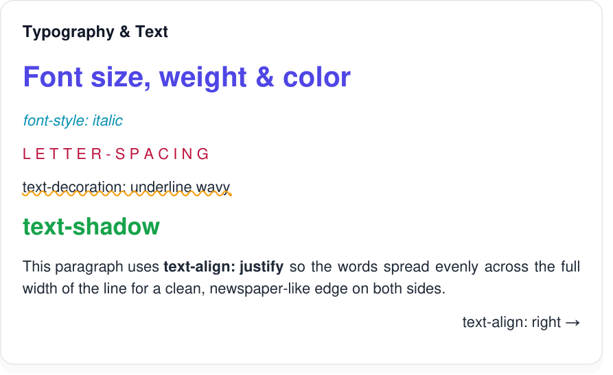
font-*, letter-spacing, text-decoration, text-shadow and text-align: justify.View HTML & CSS source
<!DOCTYPE html><html><head><meta charset="UTF-8"><style>
@page { size: A4; margin: 10mm; }
* { box-sizing: border-box; }
body { font-family: Arial, Helvetica, sans-serif; margin: 0; color: #1f2937; font-size: 14px; line-height: 1.5; }
.card { background:#fff; border:1px solid #e5e7eb; border-radius:12px; padding:18px 20px; box-shadow:0 6px 18px rgba(0,0,0,0.06); }
.cap { font-family: 'Courier New', monospace; font-size:11px; color:#6b7280; margin-bottom:6px; }
h4 { margin:0 0 12px; font-size:15px; color:#111827; }
.t-row{margin-bottom:10px}
.big{font-size:26px;font-weight:800;color:#4f46e5}
.italic{font-style:italic;color:#0891b2}
.spaced{letter-spacing:4px;text-transform:uppercase;color:#be123c}
.under{text-decoration:underline wavy #f59e0b}
.shadow{font-size:22px;font-weight:bold;text-shadow:2px 2px 0 rgba(0,0,0,0.25);color:#16a34a}
.right{text-align:right}
.just{text-align:justify}
</style></head><body>
<div class="card" style="max-width:520px">
<h4>Typography & Text</h4>
<div class="t-row big">Font size, weight & color</div>
<div class="t-row italic">font-style: italic</div>
<div class="t-row spaced">letter-spacing</div>
<div class="t-row under">text-decoration: underline wavy</div>
<div class="t-row shadow">text-shadow</div>
<div class="t-row just">This paragraph uses <b>text-align: justify</b> so the words spread evenly across the full width of the line for a clean, newspaper-like edge on both sides.</div>
<div class="t-row right">text-align: right →</div>
</div></body></html>🖼️ Web Fonts (@font-face)
Load custom fonts with @font-face — self-hosted via a relative src: url(), or remote https:// fonts (TTF, OTF, WOFF, WOFF2) which are downloaded and embedded into the PDF automatically.
@font-facefont-familysrc: url()src: local()font-weightfont-styleunicode-rangeformat()
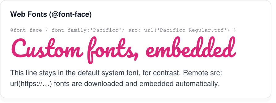
@font-face font (Pacifico); the body line stays in the default font.View HTML & CSS source
<!DOCTYPE html><html><head><meta charset="UTF-8"><style>
@page { size: A4; margin: 10mm; }
* { box-sizing: border-box; }
body { font-family: Arial, Helvetica, sans-serif; margin: 0; color: #1f2937; font-size: 14px; line-height: 1.5; }
.card { background:#fff; border:1px solid #e5e7eb; border-radius:12px; padding:18px 20px; box-shadow:0 6px 18px rgba(0,0,0,0.06); }
.cap { font-family: 'Courier New', monospace; font-size:11px; color:#6b7280; margin-bottom:6px; }
h4 { margin:0 0 12px; font-size:15px; color:#111827; }
@font-face{font-family:'Pacifico';src:url('Pacifico-Regular.ttf')}
.hero{font-family:'Pacifico',cursive;font-size:46px;color:#db2777;line-height:1.25}
.sys{font-family:Arial,Helvetica,sans-serif;font-size:15px;color:#374151;margin-top:6px}
</style></head><body>
<div class="card" style="max-width:520px">
<h4>Web Fonts (@font-face)</h4>
<div class="cap">@font-face { font-family:'Pacifico'; src: url('Pacifico-Regular.ttf') }</div>
<div class="hero">Custom fonts, embedded</div>
<div class="sys">This line stays in the default system font, for contrast. Remote <code>src: url(https://…)</code> fonts are downloaded and embedded automatically.</div>
</div></body></html>🃏 Drop Cap
Style the first letter of a paragraph as a large floated initial, with text flowing around it.
::first-letterfloatfont-sizeline-height
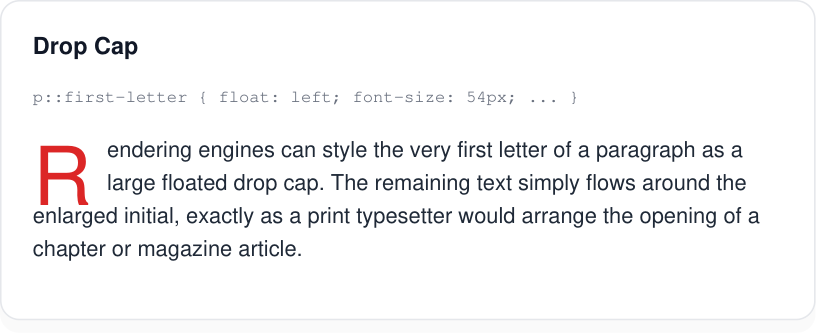
::first-letter initial with the body text wrapping around it.View HTML & CSS source
<!DOCTYPE html><html><head><meta charset="UTF-8"><style>
@page { size: A4; margin: 10mm; }
* { box-sizing: border-box; }
body { font-family: Arial, Helvetica, sans-serif; margin: 0; color: #1f2937; font-size: 14px; line-height: 1.5; }
.card { background:#fff; border:1px solid #e5e7eb; border-radius:12px; padding:18px 20px; box-shadow:0 6px 18px rgba(0,0,0,0.06); }
.cap { font-family: 'Courier New', monospace; font-size:11px; color:#6b7280; margin-bottom:6px; }
h4 { margin:0 0 12px; font-size:15px; color:#111827; }

.dc{font-size:14px}
.dc::first-letter{float:left;font-size:52px;line-height:40px;font-weight:bold;color:#dc2626;padding-right:10px}

</style></head><body>
<div class="card" style="max-width:480px">
  <h4>Drop Cap</h4>
  <div class="cap">p::first-letter { float: left; font-size: 54px; ... }</div>
  <p class="dc">Rendering engines can style the very first letter of a paragraph as a large floated drop cap. The remaining text simply flows around the enlarged initial, exactly as a print typesetter would arrange the opening of a chapter or magazine article.</p>
</div></body></html>
🌈 Gradient Text
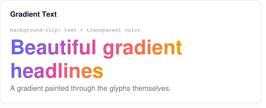
Paint a gradient through the glyphs themselves via background-clip: text with a transparent fill.
background-clip: text-webkit-background-clip: textcolor: transparentlinear-gradient()
View HTML & CSS source
<!DOCTYPE html><html><head><meta charset="UTF-8"><style>
@page { size: A4; margin: 10mm; }
* { box-sizing: border-box; }
body { font-family: Arial, Helvetica, sans-serif; margin: 0; color: #1f2937; font-size: 14px; line-height: 1.5; }
.card { background:#fff; border:1px solid #e5e7eb; border-radius:12px; padding:18px 20px; box-shadow:0 6px 18px rgba(0,0,0,0.06); }
.cap { font-family: 'Courier New', monospace; font-size:11px; color:#6b7280; margin-bottom:6px; }
h4 { margin:0 0 12px; font-size:15px; color:#111827; }

.gt{font-size:42px;font-weight:800;line-height:1.15;background:linear-gradient(135deg,#6366f1,#ec4899 50%,#f59e0b);-webkit-background-clip:text;background-clip:text;color:transparent}
.sub{font-size:15px;color:#6b7280}

</style></head><body>
<div class="card" style="max-width:500px">
  <h4>Gradient Text</h4>
  <div class="cap">background-clip: text + transparent color</div>
  <div class="gt">Beautiful gradient headlines</div>
  <div class="sub">A gradient painted through the glyphs themselves.</div>
</div></body></html>
📦 Box Model
Standard content / padding / border / margin boxes, with box-sizing: border-box support.
widthheightmarginpaddingborderbox-sizingmin-widthmax-width
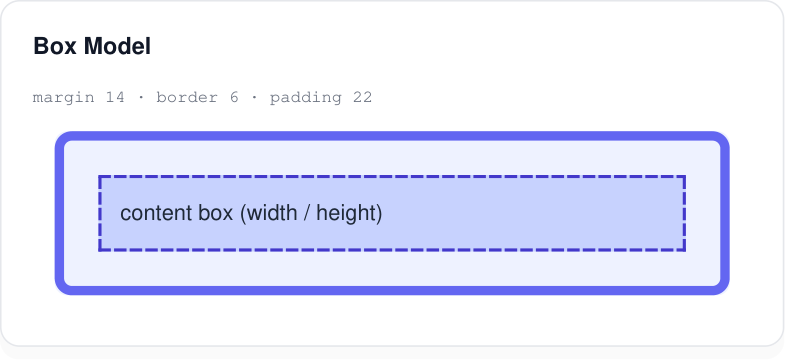
margin, border and padding spacing.View HTML & CSS source
<!DOCTYPE html><html><head><meta charset="UTF-8"><style>
@page { size: A4; margin: 10mm; }
* { box-sizing: border-box; }
body { font-family: Arial, Helvetica, sans-serif; margin: 0; color: #1f2937; font-size: 14px; line-height: 1.5; }
.card { background:#fff; border:1px solid #e5e7eb; border-radius:12px; padding:18px 20px; box-shadow:0 6px 18px rgba(0,0,0,0.06); }
.cap { font-family: 'Courier New', monospace; font-size:11px; color:#6b7280; margin-bottom:6px; }
h4 { margin:0 0 12px; font-size:15px; color:#111827; }

.bm{background:#eef2ff;border:6px solid #6366f1;padding:22px;margin:14px;border-radius:8px}
.inner{background:#c7d2fe;padding:12px;border:2px dashed #4338ca}

</style></head><body>
<div class="card" style="max-width:460px">
  <h4>Box Model</h4>
  <div class="cap">margin 14 · border 6 · padding 22</div>
  <div class="bm"><div class="inner">content box (width / height)</div></div>
</div></body></html>
🎨 Backgrounds & Gradients
Solid colors with alpha, plus linear, radial and conic gradients — including multi-layer backgrounds.
backgroundbackground-colorbackground-imagelinear-gradient()radial-gradient()conic-gradient()rgba()repeating-linear-gradient()
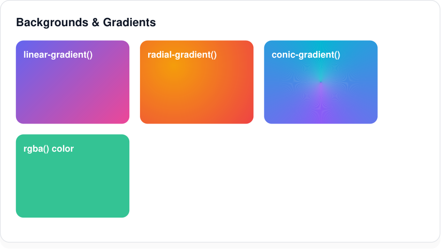
rgba() fill.View HTML & CSS source
<!DOCTYPE html><html><head><meta charset="UTF-8"><style>
@page { size: A4; margin: 10mm; }
* { box-sizing: border-box; }
body { font-family: Arial, Helvetica, sans-serif; margin: 0; color: #1f2937; font-size: 14px; line-height: 1.5; }
.card { background:#fff; border:1px solid #e5e7eb; border-radius:12px; padding:18px 20px; box-shadow:0 6px 18px rgba(0,0,0,0.06); }
.cap { font-family: 'Courier New', monospace; font-size:11px; color:#6b7280; margin-bottom:6px; }
h4 { margin:0 0 12px; font-size:15px; color:#111827; }
.grid{display:flex;gap:14px;flex-wrap:wrap}
.sw{width:150px;height:90px;border-radius:10px;color:#fff;font-size:12px;padding:10px;font-weight:bold}
.lin{background:linear-gradient(135deg,#6366f1,#ec4899)}
.rad{background:radial-gradient(circle at 30% 30%,#f59e0b,#ef4444)}
.con{background:conic-gradient(from 0deg,#06b6d4,#8b5cf6,#06b6d4)}
.rgba{background:rgba(16,185,129,0.85)}
</style></head><body>
<div class="card" style="max-width:540px">
<h4>Backgrounds & Gradients</h4>
<div class="grid">
<div class="sw lin">linear-gradient()</div>
<div class="sw rad">radial-gradient()</div>
<div class="sw con">conic-gradient()</div>
<div class="sw rgba">rgba() color</div>
</div>
</div></body></html>□ Borders & Radius
Per-side widths, styles and colors, rounded corners (including full pills), and gradient borders via border-box backgrounds.
borderborder-widthborder-styleborder-colorborder-radiusborder-top/right/bottom/left
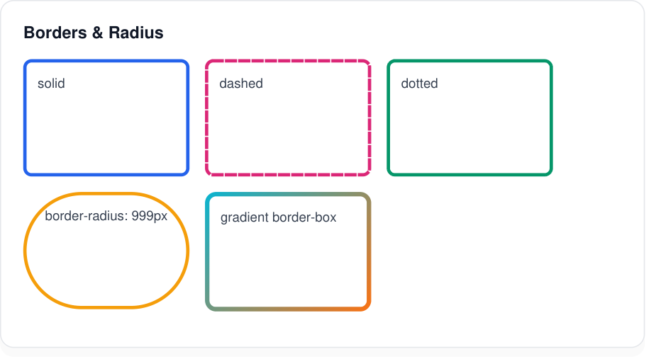
border-radius: 999px · gradient border.View HTML & CSS source
<!DOCTYPE html><html><head><meta charset="UTF-8"><style>
@page { size: A4; margin: 10mm; }
* { box-sizing: border-box; }
body { font-family: Arial, Helvetica, sans-serif; margin: 0; color: #1f2937; font-size: 14px; line-height: 1.5; }
.card { background:#fff; border:1px solid #e5e7eb; border-radius:12px; padding:18px 20px; box-shadow:0 6px 18px rgba(0,0,0,0.06); }
.cap { font-family: 'Courier New', monospace; font-size:11px; color:#6b7280; margin-bottom:6px; }
h4 { margin:0 0 12px; font-size:15px; color:#111827; }
.grid{display:flex;gap:14px;flex-wrap:wrap}
.b{width:150px;height:80px;padding:10px;font-size:12px;color:#374151}
.solid{border:3px solid #2563eb;border-radius:6px}
.dashed{border:3px dashed #db2777;border-radius:6px}
.dotted{border:3px dotted #059669;border-radius:6px}
.pill{border:3px solid #f59e0b;border-radius:999px;text-align:center}
.grad{border:4px solid transparent;border-radius:10px;background:linear-gradient(#fff,#fff) padding-box,linear-gradient(135deg,#06b6d4,#f97316) border-box}
</style></head><body>
<div class="card" style="max-width:540px">
<h4>Borders & Radius</h4>
<div class="grid">
<div class="b solid">solid</div>
<div class="b dashed">dashed</div>
<div class="b dotted">dotted</div>
<div class="b pill">border-radius: 999px</div>
<div class="b grad">gradient border-box</div>
</div>
</div></body></html>☰ Flexbox
One-dimensional flex layout with alignment, gaps and flexible grow factors.
display: flexflex-directionflex-flowjustify-contentalign-itemsgapflex
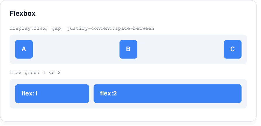
justify-content: space-between and flex grow ratios.View HTML & CSS source
<!DOCTYPE html><html><head><meta charset="UTF-8"><style>
@page { size: A4; margin: 10mm; }
* { box-sizing: border-box; }
body { font-family: Arial, Helvetica, sans-serif; margin: 0; color: #1f2937; font-size: 14px; line-height: 1.5; }
.card { background:#fff; border:1px solid #e5e7eb; border-radius:12px; padding:18px 20px; box-shadow:0 6px 18px rgba(0,0,0,0.06); }
.cap { font-family: 'Courier New', monospace; font-size:11px; color:#6b7280; margin-bottom:6px; }
h4 { margin:0 0 12px; font-size:15px; color:#111827; }

.flex{display:flex;gap:10px;background:#f1f5f9;padding:12px;border-radius:8px;margin-bottom:10px}
.between{justify-content:space-between;align-items:center}
.box{background:#3b82f6;color:#fff;padding:10px 14px;border-radius:6px;font-weight:bold}
.g1{flex:1}.g2{flex:2}

</style></head><body>
<div class="card" style="max-width:520px">
  <h4>Flexbox</h4>
  <div class="cap">display:flex; gap; justify-content:space-between</div>
  <div class="flex between"><div class="box">A</div><div class="box">B</div><div class="box">C</div></div>
  <div class="cap">flex grow: 1 vs 2</div>
  <div class="flex"><div class="box g1">flex:1</div><div class="box g2">flex:2</div></div>
</div></body></html>
☷ CSS Grid
Two-dimensional grids with fractional (fr) track sizing and gaps.
display: gridgrid-template-columnsgrid-template-rowsgapgrid-gap
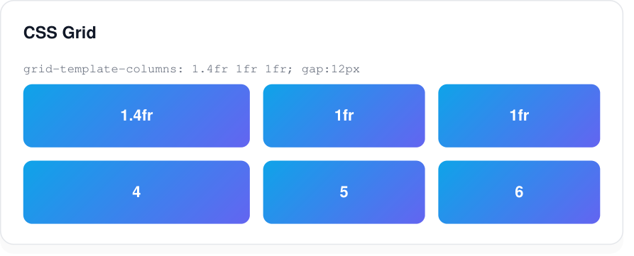
grid-template-columns: 1.4fr 1fr 1fr with a gap.View HTML & CSS source
<!DOCTYPE html><html><head><meta charset="UTF-8"><style>
@page { size: A4; margin: 10mm; }
* { box-sizing: border-box; }
body { font-family: Arial, Helvetica, sans-serif; margin: 0; color: #1f2937; font-size: 14px; line-height: 1.5; }
.card { background:#fff; border:1px solid #e5e7eb; border-radius:12px; padding:18px 20px; box-shadow:0 6px 18px rgba(0,0,0,0.06); }
.cap { font-family: 'Courier New', monospace; font-size:11px; color:#6b7280; margin-bottom:6px; }
h4 { margin:0 0 12px; font-size:15px; color:#111827; }

.grid{display:grid;grid-template-columns:1.4fr 1fr 1fr;gap:12px}
.cell{background:linear-gradient(135deg,#0ea5e9,#6366f1);color:#fff;padding:18px;border-radius:8px;font-weight:bold;text-align:center}

</style></head><body>
<div class="card" style="max-width:520px">
  <h4>CSS Grid</h4>
  <div class="cap">grid-template-columns: 1.4fr 1fr 1fr; gap:12px</div>
  <div class="grid">
    <div class="cell">1.4fr</div><div class="cell">1fr</div><div class="cell">1fr</div>
    <div class="cell">4</div><div class="cell">5</div><div class="cell">6</div>
  </div>
</div></body></html>
❚❚❚ Multi-column
Newspaper-style balanced columns with a divider rule between them.
column-countcolumn-gapcolumn-rulecolumn-width
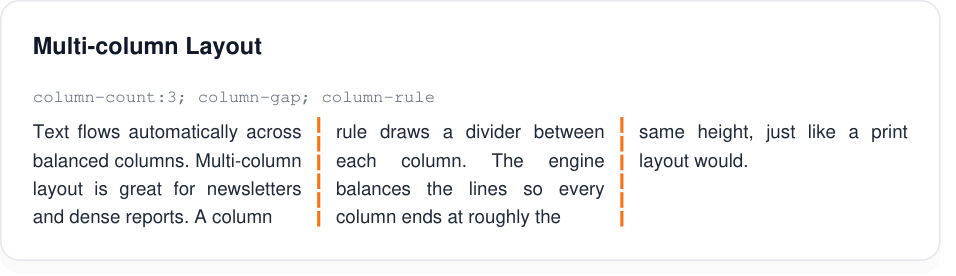
column-rule.View HTML & CSS source
<!DOCTYPE html><html><head><meta charset="UTF-8"><style>
@page { size: A4; margin: 10mm; }
* { box-sizing: border-box; }
body { font-family: Arial, Helvetica, sans-serif; margin: 0; color: #1f2937; font-size: 14px; line-height: 1.5; }
.card { background:#fff; border:1px solid #e5e7eb; border-radius:12px; padding:18px 20px; box-shadow:0 6px 18px rgba(0,0,0,0.06); }
.cap { font-family: 'Courier New', monospace; font-size:11px; color:#6b7280; margin-bottom:6px; }
h4 { margin:0 0 12px; font-size:15px; color:#111827; }

.cols{column-count:3;column-gap:22px;column-rule:2px dashed #f97316;text-align:justify;font-size:12px}

</style></head><body>
<div class="card" style="max-width:560px">
  <h4>Multi-column Layout</h4>
  <div class="cap">column-count:3; column-gap; column-rule</div>
  <div class="cols">Text flows automatically across balanced columns. Multi-column layout is great for newsletters and dense reports. A column rule draws a divider between each column. The engine balances the lines so every column ends at roughly the same height, just like a print layout would.</div>
</div></body></html>
📍 Position & Float
Relative / absolute / fixed positioning with offsets, plus floats that text wraps around.
positiontoprightbottomleftinsetz-indexfloatoverflow
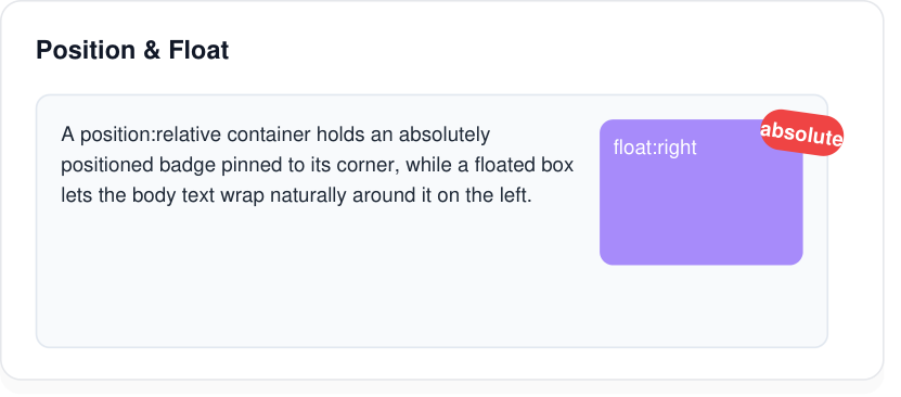
float: right box with wrapping text.View HTML & CSS source
<!DOCTYPE html><html><head><meta charset="UTF-8"><style>
@page { size: A4; margin: 10mm; }
* { box-sizing: border-box; }
body { font-family: Arial, Helvetica, sans-serif; margin: 0; color: #1f2937; font-size: 14px; line-height: 1.5; }
.card { background:#fff; border:1px solid #e5e7eb; border-radius:12px; padding:18px 20px; box-shadow:0 6px 18px rgba(0,0,0,0.06); }
.cap { font-family: 'Courier New', monospace; font-size:11px; color:#6b7280; margin-bottom:6px; }
h4 { margin:0 0 12px; font-size:15px; color:#111827; }
.rel{position:relative;height:120px;background:#f8fafc;border:1px solid #e2e8f0;border-radius:8px}
.badge{position:absolute;top:-10px;right:-10px;background:#ef4444;color:#fff;padding:6px 12px;border-radius:999px;font-size:12px;font-weight:bold;transform:rotate(8deg)}
.fl{float:right;width:120px;height:70px;background:#a78bfa;color:#fff;border-radius:8px;margin:0 0 8px 10px;padding:8px;font-size:12px}
.txt{font-size:12px}
</style></head><body>
<div class="card" style="max-width:480px">
<h4>Position & Float</h4>
<div class="rel" style="padding:14px;margin:14px 12px 0 0">
<span class="badge">absolute</span>
<div class="fl">float:right</div>
<div class="txt">A position:relative container holds an absolutely positioned badge pinned to its corner, while a floated box lets the body text wrap naturally around it on the left.</div>
</div>
</div></body></html>🔄 Transforms
2D transforms — translate, rotate, scale, skew and matrix — with a configurable origin.
transformtranslate()rotate()scale()skew()matrix()transform-origin
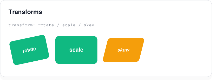
rotate(), scale() and skewX().View HTML & CSS source
<!DOCTYPE html><html><head><meta charset="UTF-8"><style>
@page { size: A4; margin: 10mm; }
* { box-sizing: border-box; }
body { font-family: Arial, Helvetica, sans-serif; margin: 0; color: #1f2937; font-size: 14px; line-height: 1.5; }
.card { background:#fff; border:1px solid #e5e7eb; border-radius:12px; padding:18px 20px; box-shadow:0 6px 18px rgba(0,0,0,0.06); }
.cap { font-family: 'Courier New', monospace; font-size:11px; color:#6b7280; margin-bottom:6px; }
h4 { margin:0 0 12px; font-size:15px; color:#111827; }

.grid{display:flex;gap:26px;padding:18px 6px}
.t{width:90px;height:60px;background:#10b981;color:#fff;display:flex;align-items:center;justify-content:center;border-radius:8px;font-size:12px;font-weight:bold}
.rot{transform:rotate(-12deg)}
.scl{transform:scale(1.15)}
.skw{transform:skewX(-14deg);background:#f59e0b}

</style></head><body>
<div class="card" style="max-width:480px">
  <h4>Transforms</h4>
  <div class="cap">transform: rotate / scale / skew</div>
  <div class="grid"><div class="t rot">rotate</div><div class="t scl">scale</div><div class="t skw">skew</div></div>
</div></body></html>
✨ Effects
Shadows, transparency, blend modes and arbitrary clipping paths.
box-shadowopacitymix-blend-modeclip-pathfilter
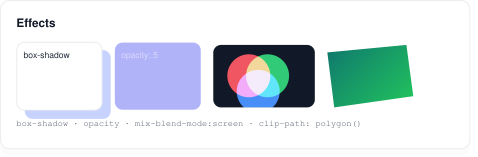
box-shadow · opacity · mix-blend-mode: screen · clip-path: polygon().View HTML & CSS source
<!DOCTYPE html><html><head><meta charset="UTF-8"><style>
@page { size: A4; margin: 10mm; }
* { box-sizing: border-box; }
body { font-family: Arial, Helvetica, sans-serif; margin: 0; color: #1f2937; font-size: 14px; line-height: 1.5; }
.card { background:#fff; border:1px solid #e5e7eb; border-radius:12px; padding:18px 20px; box-shadow:0 6px 18px rgba(0,0,0,0.06); }
.cap { font-family: 'Courier New', monospace; font-size:11px; color:#6b7280; margin-bottom:6px; }
h4 { margin:0 0 12px; font-size:15px; color:#111827; }

.grid{display:flex;gap:16px;flex-wrap:wrap;align-items:center}
.sh{width:110px;height:70px;background:#fff;border-radius:10px;box-shadow:8px 8px 0 #c7d2fe;border:1px solid #e5e7eb;padding:8px;font-size:11px}
.op{width:110px;height:70px;background:#6366f1;color:#fff;opacity:0.5;border-radius:10px;padding:8px;font-size:11px}
.blend{position:relative;width:130px;height:80px;background:#111827;border-radius:10px;overflow:hidden}
.c{position:absolute;width:55px;height:55px;border-radius:50%;mix-blend-mode:screen}
.c1{background:#ef4444;left:18px;top:12px}.c2{background:#22c55e;left:42px;top:12px}.c3{background:#3b82f6;left:30px;top:32px}
.clip{width:110px;height:80px;background:linear-gradient(135deg,#0f766e,#22c55e);clip-path:polygon(0 12%,92% 0,100% 82%,8% 100%)}

</style></head><body>
<div class="card" style="max-width:560px">
  <h4>Effects</h4>
  <div class="grid">
    <div class="sh">box-shadow</div>
    <div class="op">opacity:.5</div>
    <div class="blend"><div class="c c1"></div><div class="c c2"></div><div class="c c3"></div></div>
    <div class="clip"></div>
  </div>
  <div class="cap" style="margin-top:8px">box-shadow · opacity · mix-blend-mode:screen · clip-path: polygon()</div>
</div></body></html>
🌂 Filters
Apply image-style filter functions to any element.
filtergrayscale()sepia()invert()hue-rotate()blur()brightness()contrast()saturate()drop-shadow()
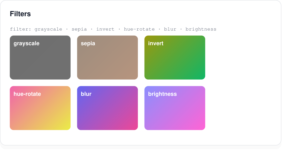
filter functions.View HTML & CSS source
<!DOCTYPE html><html><head><meta charset="UTF-8"><style>
@page { size: A4; margin: 10mm; }
* { box-sizing: border-box; }
body { font-family: Arial, Helvetica, sans-serif; margin: 0; color: #1f2937; font-size: 14px; line-height: 1.5; }
.card { background:#fff; border:1px solid #e5e7eb; border-radius:12px; padding:18px 20px; box-shadow:0 6px 18px rgba(0,0,0,0.06); }
.cap { font-family: 'Courier New', monospace; font-size:11px; color:#6b7280; margin-bottom:6px; }
h4 { margin:0 0 12px; font-size:15px; color:#111827; }

.grid{display:flex;gap:14px;flex-wrap:wrap}
.f{width:130px;height:78px;border-radius:8px;background:linear-gradient(135deg,#6366f1,#ec4899);color:#fff;font-size:12px;padding:8px;font-weight:bold}
.gray{filter:grayscale(1)}
.sepia{filter:sepia(0.9)}
.invert{filter:invert(1)}
.hue{filter:hue-rotate(90deg)}
.blur{filter:blur(2px)}
.bright{filter:brightness(1.4)}

</style></head><body>
<div class="card" style="max-width:560px">
  <h4>Filters</h4>
  <div class="cap">filter: grayscale · sepia · invert · hue-rotate · blur · brightness</div>
  <div class="grid">
    <div class="f gray">grayscale</div><div class="f sepia">sepia</div><div class="f invert">invert</div>
    <div class="f hue">hue-rotate</div><div class="f blur">blur</div><div class="f bright">brightness</div>
  </div>
</div></body></html>
📊 Tables
Collapsed or spaced borders, merged cells, striped rows and rounded clipping.
display: tableborder-collapseborder-spacingcolspanrowspan:nth-child()
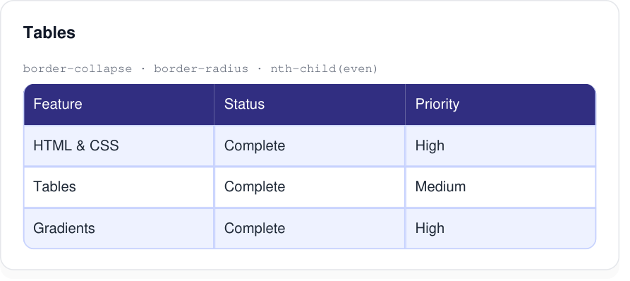
border-collapse, rounded clipping and :nth-child(even) striping.View HTML & CSS source
<!DOCTYPE html><html><head><meta charset="UTF-8"><style>
@page { size: A4; margin: 10mm; }
* { box-sizing: border-box; }
body { font-family: Arial, Helvetica, sans-serif; margin: 0; color: #1f2937; font-size: 14px; line-height: 1.5; }
.card { background:#fff; border:1px solid #e5e7eb; border-radius:12px; padding:18px 20px; box-shadow:0 6px 18px rgba(0,0,0,0.06); }
.cap { font-family: 'Courier New', monospace; font-size:11px; color:#6b7280; margin-bottom:6px; }
h4 { margin:0 0 12px; font-size:15px; color:#111827; }
table{width:100%;border-collapse:collapse;border-radius:10px;overflow:hidden;font-size:13px}
th{background:#312e81;color:#fff;padding:9px;text-align:left}
td{padding:8px;border:1px solid #c7d2fe}
tr:nth-child(even) td{background:#eef2ff}
</style></head><body>
<div class="card" style="max-width:520px">
<h4>Tables</h4>
<div class="cap">border-collapse · border-radius · nth-child(even)</div>
<table>
<tr><th>Feature</th><th>Status</th><th>Priority</th></tr>
<tr><td>HTML & CSS</td><td>Complete</td><td>High</td></tr>
<tr><td>Tables</td><td>Complete</td><td>Medium</td></tr>
<tr><td>Gradients</td><td>Complete</td><td>High</td></tr>
</table>
</div></body></html>📝 Lists & Counters
Ordered and unordered lists with many marker styles, plus CSS counters.
list-style-typelist-style-positionlist-style-imagecounter-resetcounter-incrementcounter()
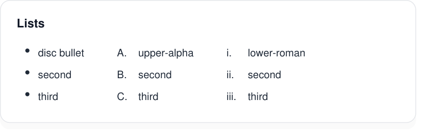
disc, upper-alpha and lower-roman markers.View HTML & CSS source
<!DOCTYPE html><html><head><meta charset="UTF-8"><style>
@page { size: A4; margin: 10mm; }
* { box-sizing: border-box; }
body { font-family: Arial, Helvetica, sans-serif; margin: 0; color: #1f2937; font-size: 14px; line-height: 1.5; }
.card { background:#fff; border:1px solid #e5e7eb; border-radius:12px; padding:18px 20px; box-shadow:0 6px 18px rgba(0,0,0,0.06); }
.cap { font-family: 'Courier New', monospace; font-size:11px; color:#6b7280; margin-bottom:6px; }
h4 { margin:0 0 12px; font-size:15px; color:#111827; }

.wrap{display:flex;gap:40px}
ul.disc{margin:0}
ol.alpha{list-style-type:upper-alpha}
ol.roman{list-style-type:lower-roman}
li{margin:4px 0;font-size:13px}

</style></head><body>
<div class="card" style="max-width:480px">
  <h4>Lists</h4>
  <div class="wrap">
    <ul class="disc"><li>disc bullet</li><li>second</li><li>third</li></ul>
    <ol class="alpha"><li>upper-alpha</li><li>second</li><li>third</li></ol>
    <ol class="roman"><li>lower-roman</li><li>second</li><li>third</li></ol>
  </div>
</div></body></html>
🔢 Generated Content & Counters
Auto-numbering with CSS counters and generated content via ::before, including nested counters (1, 1.1, 1.2…).
counter-resetcounter-incrementcontent: counter()counters()::before
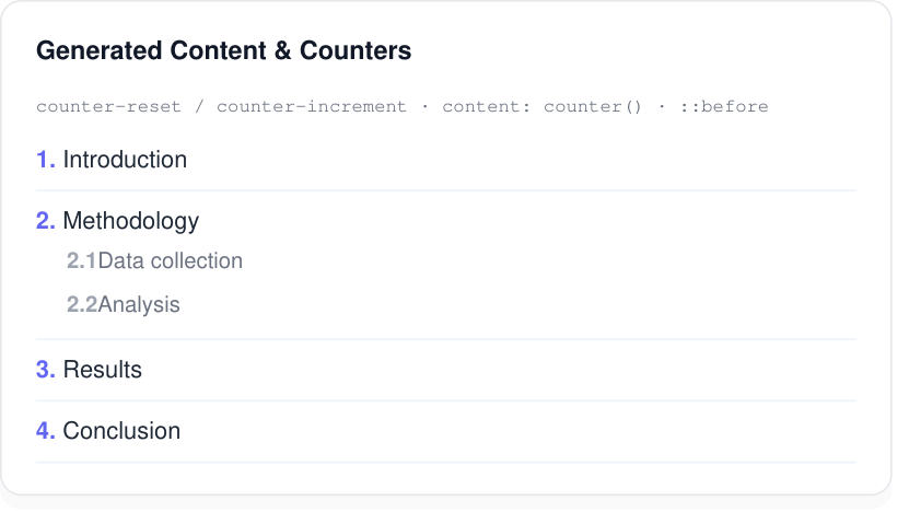
::before.View HTML & CSS source
<!DOCTYPE html><html><head><meta charset="UTF-8"><style>
@page { size: A4; margin: 10mm; }
* { box-sizing: border-box; }
body { font-family: Arial, Helvetica, sans-serif; margin: 0; color: #1f2937; font-size: 14px; line-height: 1.5; }
.card { background:#fff; border:1px solid #e5e7eb; border-radius:12px; padding:18px 20px; box-shadow:0 6px 18px rgba(0,0,0,0.06); }
.cap { font-family: 'Courier New', monospace; font-size:11px; color:#6b7280; margin-bottom:6px; }
h4 { margin:0 0 12px; font-size:15px; color:#111827; }
.toc{counter-reset:item}
.toc .row{counter-increment:item;padding:7px 0;border-bottom:1px solid #eef2ff;font-size:14px}
.toc .row::before{content:counter(item) ". ";font-weight:bold;color:#6366f1}
.sub{counter-reset:sub}
.sub .si{counter-increment:sub;font-size:13px;color:#6b7280;padding:3px 0 3px 18px}
.sub .si::before{content:counter(item) "." counter(sub) " ";font-weight:bold;color:#9ca3af}
</style></head><body>
<div class="card" style="max-width:480px">
<h4>Generated Content & Counters</h4>
<div class="cap">counter-reset / counter-increment · content: counter() · ::before</div>
<div class="toc">
<div class="row">Introduction</div>
<div class="row">Methodology
<div class="sub"><div class="si">Data collection</div><div class="si">Analysis</div></div>
</div>
<div class="row">Results</div>
<div class="row">Conclusion</div>
</div>
</div></body></html>🖼 Images & SVG
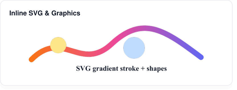
Raster images (PNG, JPEG, GIF, BMP, WebP) and inline SVG with gradients, paths and shapes.
<img><svg><path><circle>linearGradientstrokefilldata: URIs
View HTML & CSS source
<!DOCTYPE html><html><head><meta charset="UTF-8"><style>
@page { size: A4; margin: 10mm; }
* { box-sizing: border-box; }
body { font-family: Arial, Helvetica, sans-serif; margin: 0; color: #1f2937; font-size: 14px; line-height: 1.5; }
.card { background:#fff; border:1px solid #e5e7eb; border-radius:12px; padding:18px 20px; box-shadow:0 6px 18px rgba(0,0,0,0.06); }
.cap { font-family: 'Courier New', monospace; font-size:11px; color:#6b7280; margin-bottom:6px; }
h4 { margin:0 0 12px; font-size:15px; color:#111827; }
.wrap{text-align:center}
</style></head><body>
<div class="card" style="max-width:480px">
<h4>Inline SVG & Graphics</h4>
<div class="wrap">
<svg width="420" height="120" viewBox="0 0 420 120">
<defs><linearGradient id="g" x1="0" x2="1">
<stop offset="0%" stop-color="#f97316"/><stop offset="50%" stop-color="#ec4899"/><stop offset="100%" stop-color="#6366f1"/>
</linearGradient></defs>
<path d="M20 80 C90 10,130 110,200 45 S320 15,400 75" fill="none" stroke="url(#g)" stroke-width="12" stroke-linecap="round"/>
<circle cx="80" cy="48" r="18" fill="#fde68a"/>
<circle cx="250" cy="54" r="24" fill="#bfdbfe"/>
<text x="120" y="105" font-size="16" font-weight="bold" fill="#111827">SVG gradient stroke + shapes</text>
</svg>
</div>
</div></body></html>🌍 Languages & Emoji
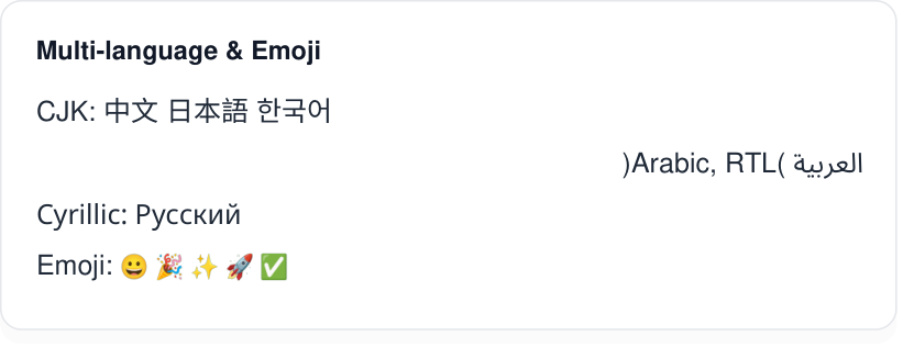
Worldwide scripts with proper shaping and bidirectional layout, plus full-color emoji — all from built-in fonts.
directionunicode-bidiwriting-modeCJKArabic (RTL)HebrewCyrillicColor emoji
View HTML & CSS source
<!DOCTYPE html><html><head><meta charset="UTF-8"><style>
@page { size: A4; margin: 10mm; }
* { box-sizing: border-box; }
body { font-family: Arial, Helvetica, sans-serif; margin: 0; color: #1f2937; font-size: 14px; line-height: 1.5; }
.card { background:#fff; border:1px solid #e5e7eb; border-radius:12px; padding:18px 20px; box-shadow:0 6px 18px rgba(0,0,0,0.06); }
.cap { font-family: 'Courier New', monospace; font-size:11px; color:#6b7280; margin-bottom:6px; }
h4 { margin:0 0 12px; font-size:15px; color:#111827; }
.row{margin:6px 0;font-size:16px}
.rtl{direction:rtl;text-align:right}
</style></head><body>
<div class="card" style="max-width:480px">
<h4>Multi-language & Emoji</h4>
<div class="row">CJK: 中文 日本語 한국어</div>
<div class="row rtl">العربية (Arabic, RTL)</div>
<div class="row">Cyrillic: Русский</div>
<div class="row">Emoji: 😀 🎉 ✨ 🚀 ✅</div>
</div></body></html>🗎 Writing Mode
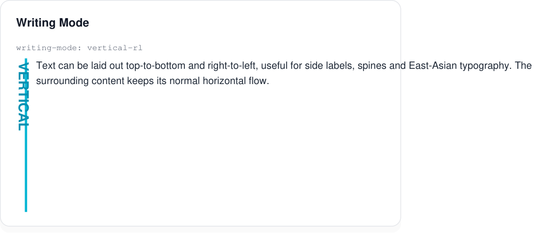
Lay text out vertically — useful for side labels, spines and East-Asian typography.
writing-mode: vertical-rlwriting-mode: vertical-lrtext-orientation
View HTML & CSS source
<!DOCTYPE html><html><head><meta charset="UTF-8"><style>
@page { size: A4; margin: 10mm; }
* { box-sizing: border-box; }
body { font-family: Arial, Helvetica, sans-serif; margin: 0; color: #1f2937; font-size: 14px; line-height: 1.5; }
.card { background:#fff; border:1px solid #e5e7eb; border-radius:12px; padding:18px 20px; box-shadow:0 6px 18px rgba(0,0,0,0.06); }
.cap { font-family: 'Courier New', monospace; font-size:11px; color:#6b7280; margin-bottom:6px; }
h4 { margin:0 0 12px; font-size:15px; color:#111827; }

.wrap{display:flex;gap:26px;align-items:flex-start}
.vert{writing-mode:vertical-rl;height:200px;font-size:18px;font-weight:bold;color:#0891b2;border-right:3px solid #06b6d4;padding-right:10px}
.body{font-size:13px;max-width:300px}

</style></head><body>
<div class="card" style="max-width:480px">
  <h4>Writing Mode</h4>
  <div class="cap">writing-mode: vertical-rl</div>
  <div class="wrap">
    <div class="vert">VERTICAL</div>
    <div class="body">Text can be laid out top-to-bottom and right-to-left, useful for side labels, spines and East-Asian typography. The surrounding content keeps its normal horizontal flow.</div>
  </div>
</div></body></html>
⌨️ Form Controls
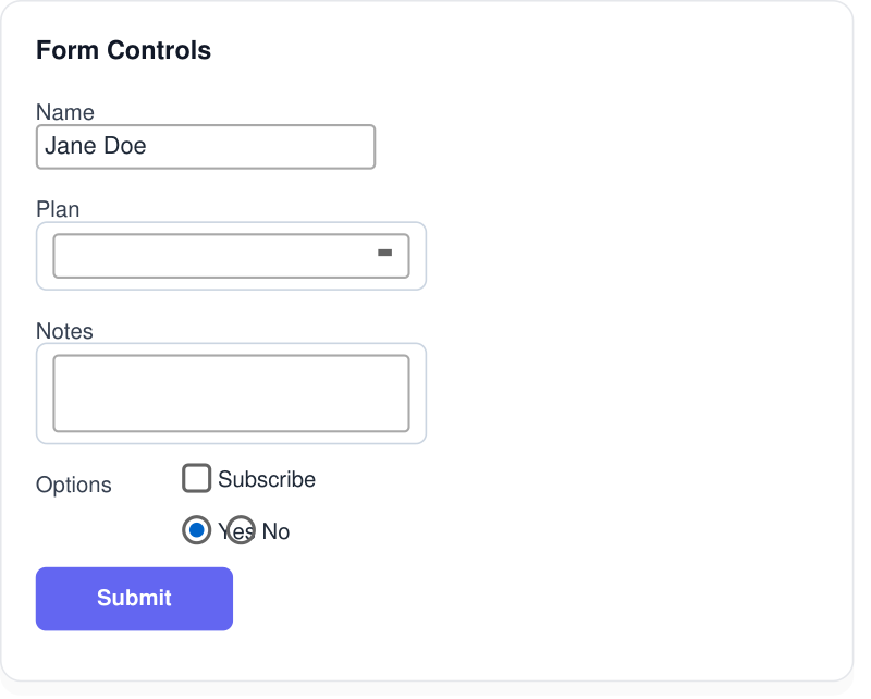
Form elements render as styled controls in the PDF — handy for printable forms and templates.
<input><select><textarea><button>checkboxradio
View HTML & CSS source
<!DOCTYPE html><html><head><meta charset="UTF-8"><style>
@page { size: A4; margin: 10mm; }
* { box-sizing: border-box; }
body { font-family: Arial, Helvetica, sans-serif; margin: 0; color: #1f2937; font-size: 14px; line-height: 1.5; }
.card { background:#fff; border:1px solid #e5e7eb; border-radius:12px; padding:18px 20px; box-shadow:0 6px 18px rgba(0,0,0,0.06); }
.cap { font-family: 'Courier New', monospace; font-size:11px; color:#6b7280; margin-bottom:6px; }
h4 { margin:0 0 12px; font-size:15px; color:#111827; }

.field{margin-bottom:11px}
label{display:inline-block;width:86px;font-size:13px;color:#374151;vertical-align:middle}
input[type=text],select,textarea{font-family:Arial;font-size:13px;padding:6px 9px;border:1px solid #cbd5e1;border-radius:6px;width:230px;vertical-align:middle}
textarea{vertical-align:top;height:46px}
.btn{background:#6366f1;color:#fff;border:none;border-radius:6px;padding:9px 18px;font-weight:bold;font-size:13px}
.check{font-size:13px;margin-right:28px}

</style></head><body>
<div class="card" style="max-width:460px">
  <h4>Form Controls</h4>
  <div class="field"><label>Name</label><input type="text" value="Jane Doe"></div>
  <div class="field"><label>Plan</label><select><option>Pro</option><option>Free</option></select></div>
  <div class="field"><label>Notes</label><textarea>Multi-line text area</textarea></div>
  <div class="field"><label>Options</label><span class="check"><input type="checkbox" checked> Subscribe</span></div>
  <div class="field"><label></label><span class="check"><input type="radio" checked> Yes</span><span class="check"><input type="radio"> No</span></div>
  <div class="field"><label></label><button class="btn">Submit</button></div>
</div></body></html>
📚 Quick Reference
Units, color formats and selectors the engine understands.
Units
px | Pixels (1px = 0.75pt) |
pt | Points (1/72 inch) |
em / rem | Relative to font / root size |
% | Percentage |
mm / cm / in | Physical units |
vw / vh | Viewport units |
Colors
red | Named colors, transparent |
#RGB | 3-digit hex |
#RRGGBB | 6-digit hex |
#RRGGBBAA | Hex with alpha |
rgb() / rgba() | RGB with optional alpha |
Selectors
div .cls #id *div pdiv > p:first-child :last-child :nth-child()::before ::after ::first-letter ::first-line⚙️ At-rules
Page setup, custom fonts and print styling.
@page
Set page size (A4, Letter, custom W H) and margin. |
@page { size: A4; margin: 15mm; } |
@font-face
Load custom fonts with src, font-weight, font-style, unicode-range and more. |
@media print
| Print-specific rules are always applied during PDF generation. |